Back in 2018 I wrote about how to apply Brendan Gregg’s FlameGraphs for visualizing SQL plan execution time 1, using the plan node-level context and timing data that some database engines provide.
This approach is not designed to replace the traditional plan display methods that are packed with lots of additional metrics and details. Nevertheless, in case of large execution plans, SQL plan flamegraphs give you a quick overview of both the plan structure, tables and operations involved and where (in which plan subtrees) most of the plan execution time is spent.
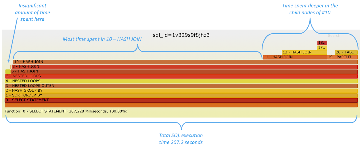
An image from the previous post is here:

In the previous article I didn’t add any more interesting metrics to the graph, other than the plan node level total execution time consumption that was visualized as the “flame bar” width itself. I queried these values from the database, with additional useful context, like execution plan node ID, plan operation type and table/index names when relevant.
But this doesn’t give you an answer to the immediately following question, when troubleshooting time or resource consumption:
If an operation consumed a lot of time, then how many times was it invoked?
This can be easily answered - both Oracle and Postgres provide this info already, so it was a pretty small change to make to my Oracle script. I just uploaded a new version of sqlflame.sql (for Oracle) into my TPT repo. I just appended the starts=X field into each flamebar’s text. “Starts” in Oracle terminology is the same thing as “loops” in Postgres plan output. And while I was at it, I added each plan node’s “produced rows” rows=N field to the output too. After all, the number of rows produced by a plan node greatly affects how much work has to be done elsewhere, in subsequent stages of the plan’s dataflow.
These details help you see whether some index range scan takes a lot of time (bar width in the flamegraph) because it’s executed 10,000 times in a loop (under some nested loop join for example) or it’s just a single wide index range scan that visits many blocks even for one invocation. Look at the starts value in the example below:

In this example, you see that the plan step 6 - INDEX RANGE SCAN has taken the most of runtime during the latest SQL execution - because it’s the widest bar without anything “on top of it”. Since the operation 6 is a child of a NESTED LOOPS join (2) and its sibling is the operation 3 (that gets its rows from 4), I hovered my mouse over the operation 4 - TABLE ACCESS BY INDEX ROWID, to see how many rows it produced. The number of rows coming from the driving (left) rowsource under a nested loop typically dictates how many times the SQL execution engine has to visit the other sibling row-source under the same nested loop.
Indeed, the left side child rowsource 3 - INLIST ITERATOR and a grandchild 4 - TABLE ACCESS BY INDEX ROWID of the join 2 - NESTED LOOPS had produced 332270 rows, therefore this nested loop had to go and visit/lookup the right side of its join path 332270 times! This is visible as the starts=332270 value in the 6 - INDEX RANGE SCAN node of the execution plan above. So we are likely not dealing with an inefficient index range scan (although that may also be true at the same time), but rather the fact that we are performing over 300k index range scans (looking for different values) in a loop - all during a single execution of this SQL statement!
I have included a SVG file of another execution of the same query below. Oracle had chosen a different plan for the same query this time, probably because of its cardinality feedback feature that learns the real row-counts and optimizer misestimates from the first execution.
If you click on the image below, you can interact with this SVG and zoom in & out to specific branches of the plan and hover your mouse over the bars to see details more clearly:
The same logic still applies, if the left side child of a 2 - NESTED LOOPS join (node ID 3 that gets its rows from node 4) returns 332270 rows, that nested loop has to perform range lookups from its other child on the right side (6 - INDEX RANGE SCAN) the same number of times too (thus #6 has starts=332270). Thanks to the plan change this time, the join #2 feeds all 644905 matching rows to its parent 1 - NESTED LOOPS join that then performs 644905 table single-row lookups against 7 - TABLE ACCESS BY INDEX ROWID using the row address (rowid) as long as it keeps getting more records from the driving side (left side) row-source of the join (#2).
That’s probably a lot of detail to follow, but the main point is that the number of rows returned by execution plan operators affect what happens (and how much of it) later on in subsequent steps, higher up in the execution plan tree. Finding ways to reduce row-counts early, closer to the leaves of the execution plan tree, will pay off in later processing steps. That’s true even if you don’t have any nested loops in your plans, because sorting, grouping, hashing 1M rows is still going to be cheaper than doing the same for 10M rows.
Here are two more examples, of running the same (tpcds10) query on my data warehouse TPCDS-like testing schema. The query itself is pretty complex and the optimizer wasn’t able to transform and unnest multiple levels of nested correlated subqueries (that were concatenated with OR operations) into “single-visit set operations”. That’s why some FILTER loop operators are still left in the execution plans (FILTER loops are a little bit like nested loops, although they do not join data, but can perform complex and pretty arbitrary filter lookups from other tables, for each row that is fed to it). But that ends up with lots of looping and revisiting other branches (like subqueries that couldn’t be merged/unnested) frequently.
You can right-click on the SVG images below and open them in a new tab for an interactive view. If some bars are too narrow to see the full picture, you can just hover your mouse over the bar and see the full text in the bottom of the graph (or tooltip that pops up after a while). Or click on a bar to zoom into only that operator and its children.
All of the initial operations from #0-#8 have starts=1, so there was no looping or revisiting overhead there. But the 9 - FILTER operator has starts=723. It was invoked 723 times by its parent operator 5 - FILTER, each time with a task of checking if the next supplied row matched the complex subquery-based filter conditions. Therefore its child 10 - NESTED LOOPS SEMI was also looped through (revisited) 723 times and so on.
The widest bars on the top of the stack are TABLE ACCESS FULL [TPCDS.DATE_DIM] operations (11, 14). Even though the DATE_DIM table is not very big, full table scanning through it 723 times ended up taking noticeable time.
Since the FILTER looping couldn’t be avoided due to the query complexity in this case, I just made each loop iteration faster - by creating a relevant index on the DATE_DIM column, to support the correlated subquery lookups. If you look into 9 - FILTER below, you still see that starts=723, so it’s invoked the same number of times, but thanks to the index speedup down the line, it gets each of its loop iterations done faster.
As a result, the relative time breakdown of these two query executions have shifted and it’s visible from the shape of the flamegraph layers. If you click on each of the SVGs and hover your mouse over the bottom layer/bar, you see that the second execution with the index took around 800ms vs. 2700ms on the first try.
Summary
It was a pretty small change to the sqlflame.sql file, but now it should be more useful, showing the “Starts” (loops) and row-counts produced by each execution plan operator right within the flamegraph “bars” themselves. Visually, the graph looks somewhat busier, but ok enough for my eyes - however you often have to zoom in to, or hover over a smaller bar that itself did not take much time to run, but possibly generated lots of rows that had to be processed elsewhere in the plan.
In the original article I mentioned that perhaps I should color-code the bars where the numbers of starts/loops would be the “temperature” of the bar. Haven’t gotten to test this out yet. Brendan has published some examples of meaningfully adjusting the colors of individual bars in the past. 2 3
Given that there are JavaScript libraries like d3-flame-graph for rendering the flamegraphs in your browser, one could add plenty of additional information into a proper tooltip/popup with JS, without making the individual flamebars too “busy” with text. You could even show the filter/access predicates associated with a plan node in the popup!
Bookshelf Graphs
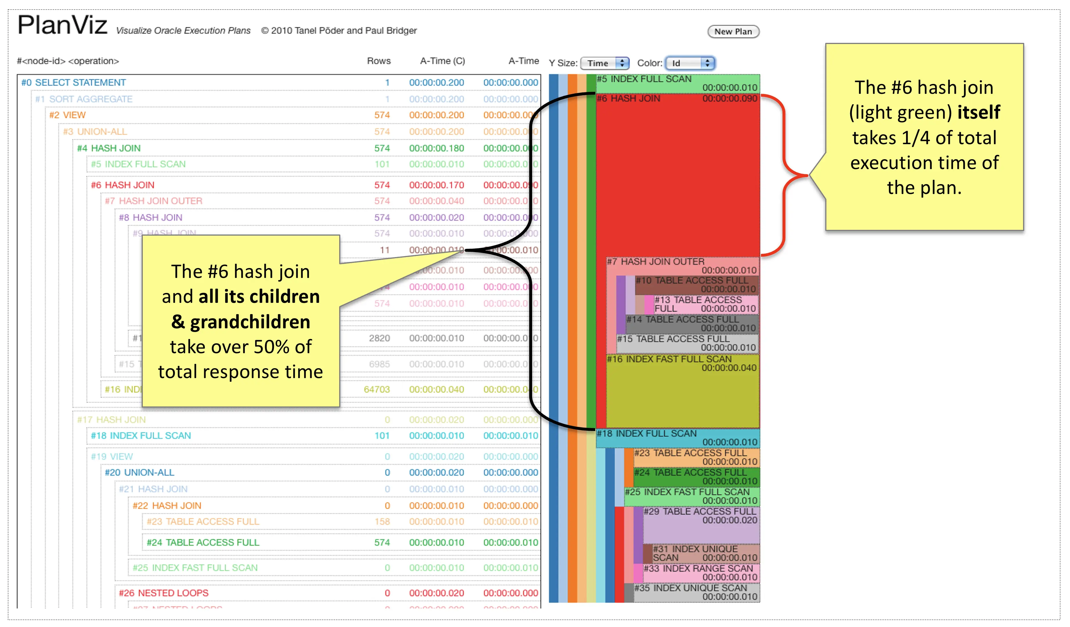
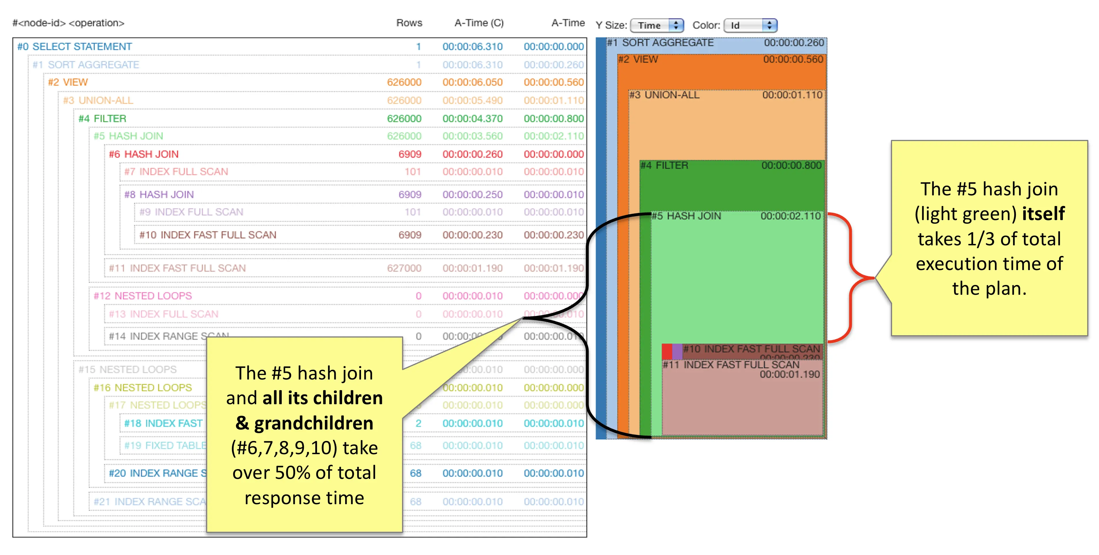
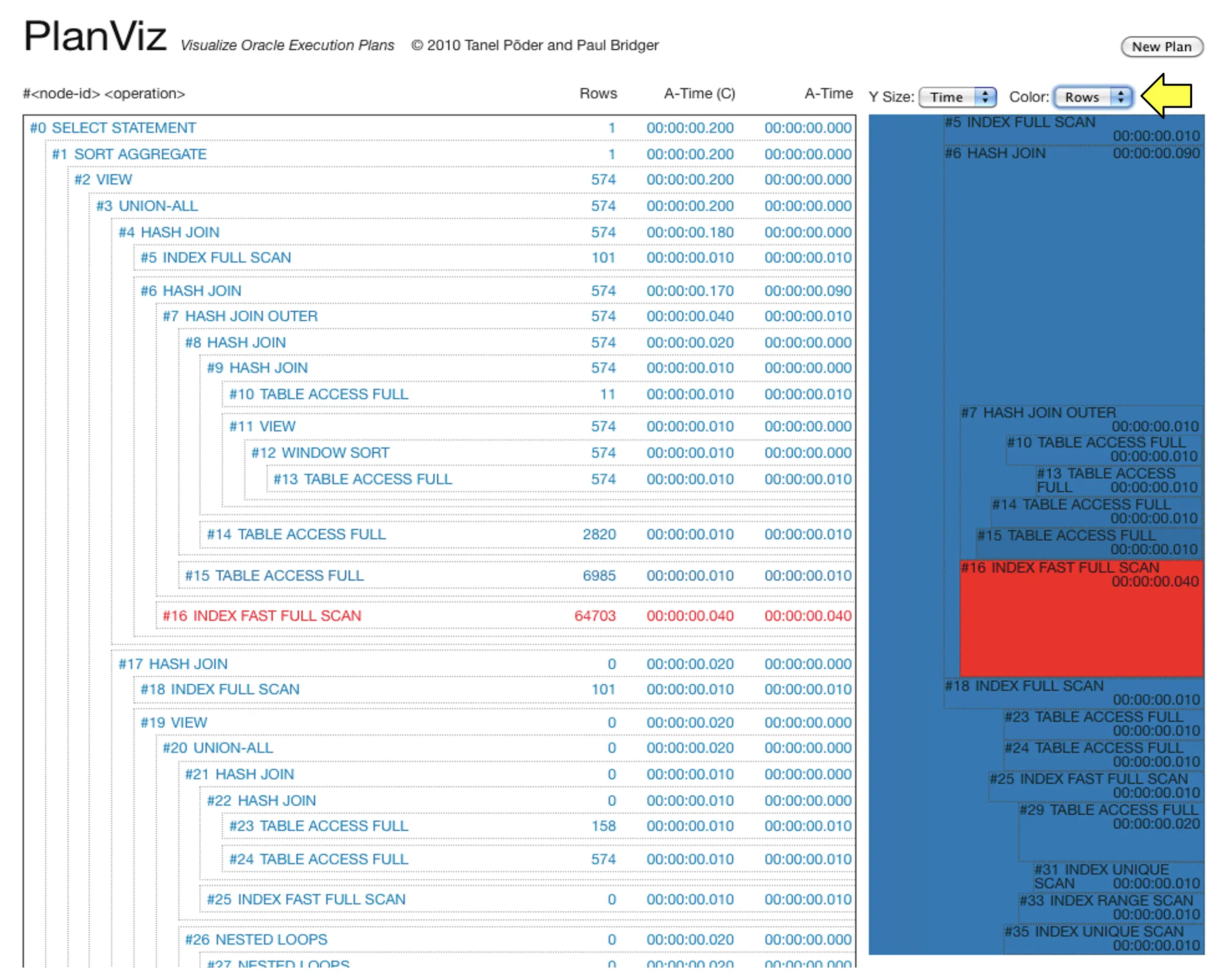
Update: I had already forgotten about this, but back in 2009 when working on a previous startup E2SN, we created an interactive visualization web app for breaking down SQL plan execution time and other metrics. We didn’t even have a name for that visualization (other than PlanViz), but I later started calling it Bookshelf Graphs - as if you click on the first image to enlarge it and then tilt your head, some parts of it look like a wildly colorful bookshelf!
On the rightmost image you see that we used metrics like “Actual rows produced” to increase the heatmap temperature of SQL plan nodes that produced the most rows (or did issue the most I/Os or use lots of memory, etc). Fun times!


