Datadog recently released a free online service explain.datadoghq.com where you can paste in your explained SQL execution plans with metrics as JSON text and it visualizes it for you. They support multiple different databases. Hopefully the interactive UI features help you determine where the problem is, without having to mentally parse and scroll through lots of text. This is a topic close to my heart, as you can tell from my “xb” scripts. And some of you may remember the PlanViz app for visualizing Oracle execution plan metrics I published back in 2010.
Datadog’s plan visualizer first supported PostgreSQL, MySQL/MariaDB, SQL Server, MongoDB execution plans and they just recently added Oracle and ClickHouse support too. Being a long-time Oracle database performance nerd, I had to run a few tests and then inevitably ended up hacking the plan metrics extraction query too! :-)
Probably needless to say, but if you decide to paste information to external services, make sure that your extracted SQL plan doesn’t contain any sensitive data, like real-world values in filter predicates, etc.
This is what you get - you run the supplied plan extraction query that reads V$SQL_PLAN_STATISTICS_ALL (in Oracle’s case) and it produces a JSON CLOB as output. You paste it into the web UI and as long as the JSON is valid, you get this screen:
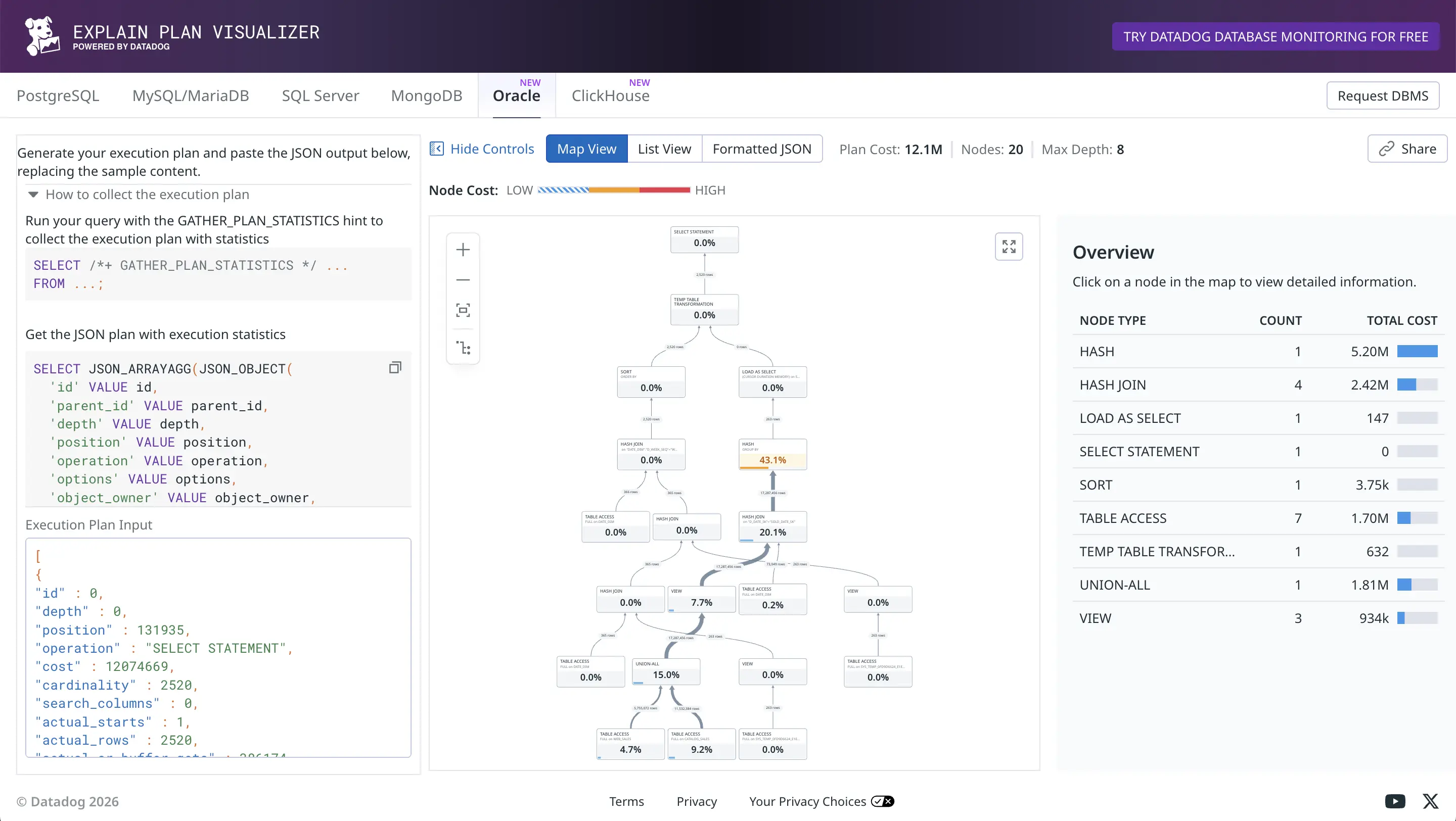
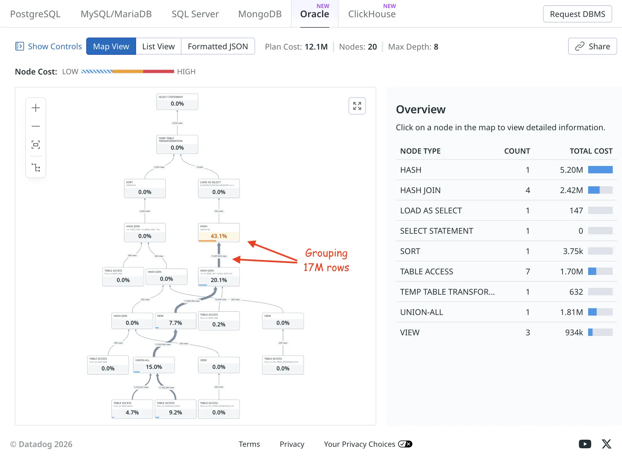
I’m not a big fan of tree-based visualization of plans myself, but nevertheless it’s useful to see the relative row counts flowing up from child operators to parents as thick or thin connecting lines (thick means more rows). The orange HASH GROUP BY took a total of 43.1% of the plan execution time, as it had to examine and group 17M rows fed to it.
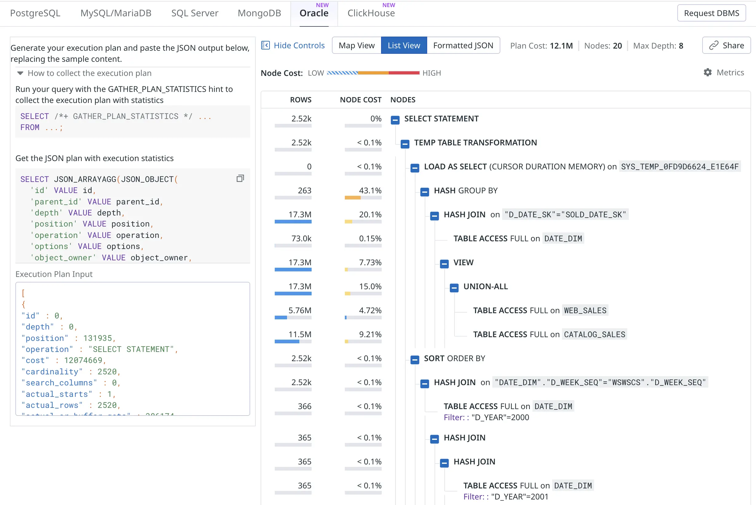
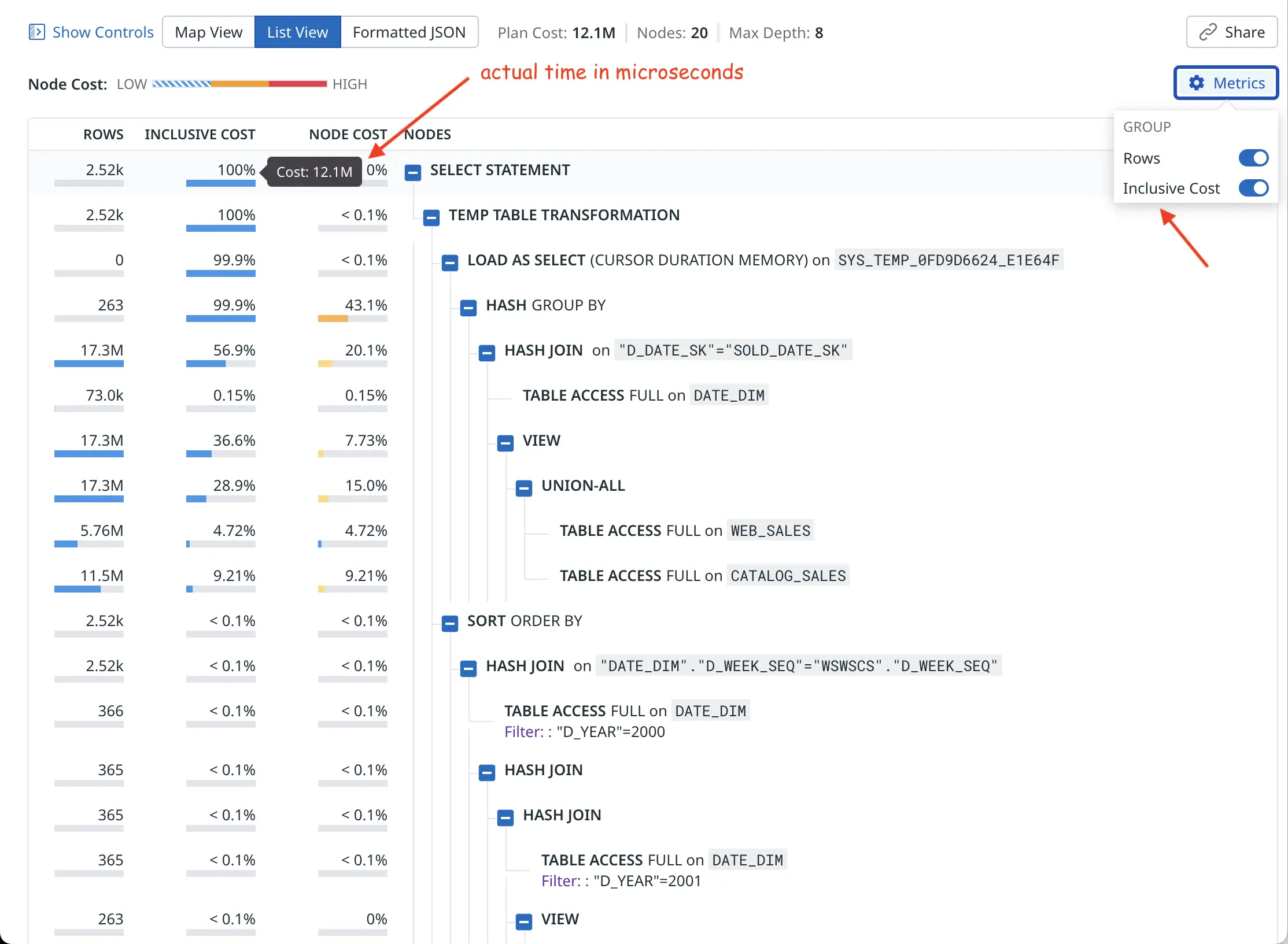
The list view produces a more condensed version of the same plan. The “node cost” is what I’ve called self-cost or self-usage of resources, it shows resource usage of only this plan node (execution plan line) and is not inclusive of any child operators’ activity in a cumulative way:
Ok, I promised that there’d be some hacking. The current early version of Oracle plan visualizer shows the optimizer’s estimated cardinality (E-rows) and estimated optimizer cost for plotting the charts. You can click on individual nodes to see all metrics, but I’m more interested in the actual rows produced (A-rows) and actual execution time taken by each plan node as a starting point overview.
It’s probably easy to add a toggle for this in the UI. I plan to pester Datadog folks on Linkedin about this! But for now I just changed the plan extraction query to use the actual last_output_rows instead of optimizer cardinality estimate and last_elapsed_time instead of the optimizer cost :-)
SELECT JSON_ARRAYAGG(JSON_OBJECT(
  'id' VALUE id,
  'parent_id' VALUE parent_id,
  'depth' VALUE depth,
  'position' VALUE position,
  'operation' VALUE operation,
  'options' VALUE options,
  'object_owner' VALUE object_owner,
  'object_name' VALUE object_name,
  'object_alias' VALUE object_alias,
  'object_type' VALUE object_type,
  -- 'cost' VALUE cost,
  'cost' VALUE last_elapsed_time,
  -- 'cardinality' VALUE cardinality,
  'cardinality' VALUE last_output_rows,
  'bytes' VALUE bytes,
  'cpu_cost' VALUE cpu_cost,
  'io_cost' VALUE io_cost,
  'temp_space' VALUE temp_space,
  'access_predicates' VALUE access_predicates,
  'filter_predicates' VALUE filter_predicates,
  'projection' VALUE projection,
  'search_columns' VALUE search_columns,
  'partition_start' VALUE partition_start,
  'partition_stop' VALUE partition_stop,
  'actual_starts' VALUE last_starts,
  'actual_rows' VALUE last_output_rows,
  'actual_cr_buffer_gets' VALUE last_cr_buffer_gets,
  'actual_disk_reads' VALUE last_disk_reads,
  'actual_disk_writes' VALUE last_disk_writes,
  'actual_elapsed_time' VALUE last_elapsed_time,
  'actual_memory_used' VALUE last_memory_used,
  'actual_parallel_degree' VALUE last_degree,
  'actual_tempseg_size' VALUE last_tempseg_size
  ABSENT ON NULL
) ORDER BY id RETURNING CLOB) AS json_plan
FROM
    v$sql_plan_statistics_all
WHERE
    (sql_id, child_number) = (SELECT prev_sql_id, prev_child_number
                              FROM v$session
                              WHERE sid = SYS_CONTEXT('USERENV', 'SID'))
So this way I’m “fooling” the visualizer to show the actual row counts and actual runtime instead of optimizer’s cardinality/cost estimates in the overview chart:
So the “cost” value now comes from Oracle’s last_elapsed_time field and 12M microseconds is about 12 seconds of runtime, as confirmed by my xbi.sql script below (wide output, you may need to scroll right):
SQL> @xbi 249qjrb91bb6n 0
-- xbi.sql: eXplain Better v1.01 for sql_id=249qjrb91bb6n child=0 - by Tanel Poder (https://tanelpoder.com)

         SQL_ID         CHLD ADDRESS          Plan Hash Value First Load Time
-------- ------------- ----- ---------------- --------------- --------------------------------------------------------------------------------------------
Cursor:  249qjrb91bb6n     0 000000010CA92508      2166267056 Statement first parsed at: 2026-02-28/19:55:14 - 285 seconds ago

 Pred    Op                                                         Query Block             ms spent in  Real #rows     Est. rows   Opt. Card.   Optimizer
 #Col    ID Row Source                                              name                 this operation    returned         total  misestimate        Cost
----- ----- ------------------------------------------------------- -------------------- -------------- ----------- ------------- ------------ -----------
          0 SELECT STATEMENT                                        >>> Plan totals >>>       12,074.67        2520                                 131935
          1  TEMP TABLE TRANSFORMATION                              SEL$E3E3B9B2                    .63        2520
          2   LOAD AS SELECT (CURSOR DURATION MEMORY) [SYS_TEMP...  SEL$16C51A37                    .15           0
          3    HASH GROUP BY                                                                   5,199.57         263         10436          40x      131487
    A     4     HASH JOIN                                                                      2,422.72    17287456      17287456           1x      131209
          5      TABLE ACCESS FULL [DATE_DIM]                       SEL$16C51A37                  18.54       73049         73049           1x         207
          6      VIEW                                               SET$1                        933.64    17287456      17287456           1x      105509
          7       UNION-ALL                                         SET$1                      1,809.20    17287456
          8        TABLE ACCESS FULL [WEB_SALES]                    SEL$2                        570.38     5755072       5755072           1x       34851
          9        TABLE ACCESS FULL [CATALOG_SALES]                SEL$3                      1,112.12    11532384      11532384           1x       70657
         10   SORT ORDER BY                                                                        3.75        2520            13        -194x         448
    A    11    HASH JOIN                                                                            .31        2520            13        -194x         447
    F    12     TABLE ACCESS FULL [DATE_DIM]                        SEL$E3E3B9B2                   1.82         366           366           1x         206
    A    13     HASH JOIN                                                                           .16         365           365           1x         241
    A    14      HASH JOIN                                                                          .16         365           365           1x         224
    F    15       TABLE ACCESS FULL [DATE_DIM]                      SEL$E3E3B9B2                   1.50         365           365           1x         206
         16       VIEW                                              SEL$D5E710A0                    .00         263         10436          40x          17
         17        TABLE ACCESS FULL [SYS_TEMP_0FD9D6624_E1E64F]    SEL$D5E710A0                    .01         263         10436          40x          17
         18      VIEW                                               SEL$D5E7109F                    .00         263         10436          40x          17
         19       TABLE ACCESS FULL [SYS_TEMP_0FD9D6624_E1E64F]     SEL$D5E7109F                    .01         263         10436          40x          17

   Op Query Block
   ID name                   Predicate Information (identified by operation id):
----- -------------------- - ----------------------------------------------------------------------------------------------------
    4                      - access("D_DATE_SK"="SOLD_DATE_SK")
   11                      - access("DATE_DIM"."D_WEEK_SEQ"="WSWSCS"."D_WEEK_SEQ")
   12 SEL$E3E3B9B2         - filter("D_YEAR"=2000)
   13                      - access("WSWSCS"."D_WEEK_SEQ"="WS"."D_WEEK_SEQ"-53)
   14                      - access("D"."D_WEEK_SEQ"="WS"."D_WEEK_SEQ")
   15 SEL$E3E3B9B2         - filter("D_YEAR"=2001)
Now, how to get the JSON data out of the database without any formatting, truncating and line wrapping problems? Since the query returns a CLOB, you can just click on it in SQL Developer and copy the whole thing as one very long line:
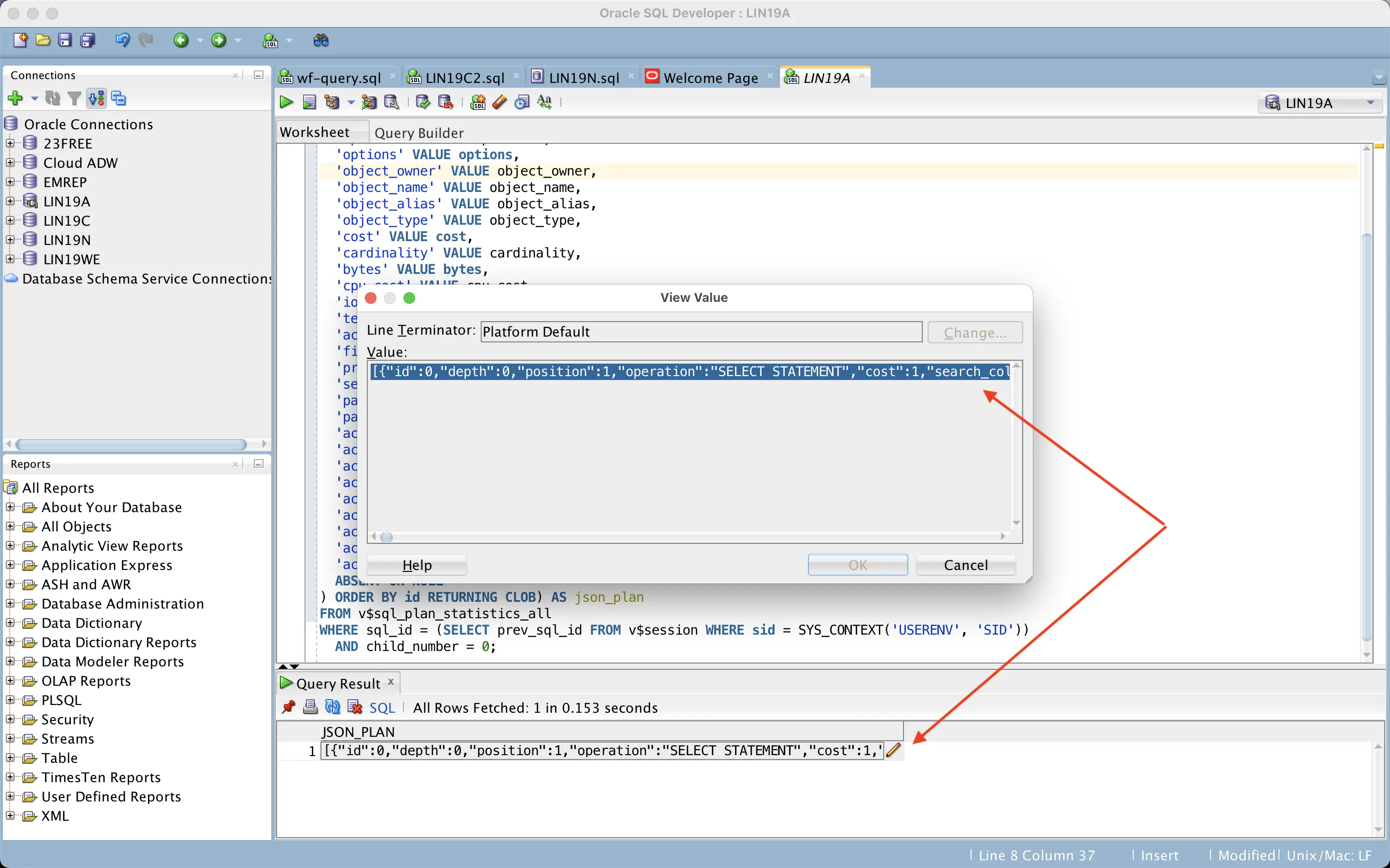
Sqlplus on the command line is trickier as it would wrap the output lines at places not suitable for the JSON format. I created a couple of experimental scripts (xdd.sql and xddi.sql) that use a wide sqlplus linesize together with the JSON pretty-print option (but might still be problematic with wide output lines, like projection list, etc).
That’s pretty much all! I’m sure there will be future improvements for the web UI, for example, I’d like to see cardinality misestimates visualized in some way. Different database engines have different features available in the UI, one cool feature for PostgreSQL is that you can click on an execution plan node and it highlights from which part of the SQL query that node comes from:
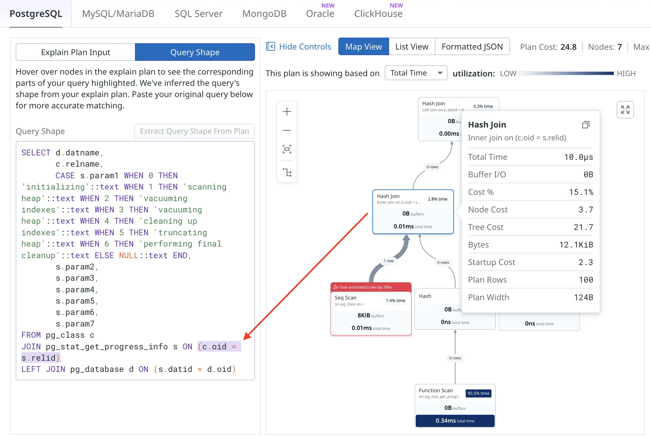
This would get more interesting when visualizing heavily transformed queries or queries against views :-)